Creating the digital has been a tiresome and hard task. This is because creating the perfect cd cover isn't as easy as taking pictures and editing them into a square cover. It requires taking the correct images, with the right poses, background, and facial expression, while also editing the images in the correct way which gets across the message the band wants to put across when someone looks at the cd case.
We started of taking images of the band with a green screen behind and different poses and facial expressions; these are some examples of the pictures taken
The problem with these images is that for almost every front cover idea, it required us to heavily edit the pictures, extracting the green screen to replace the background and even after that the poses and the positions that the band was standing in never seemed right. All of the pictures were limited by the size of the green screen, meaning the band had to stand in front of the green screen with no space in between to make it easier to edit. In turn it made the band look uniform and authoritarian which was the complete opposite look our star image of our band was meant to be. We created a front cover using the best image we could find, and editing it in a way we thought matched our star image, genre, and target audience, of being a grunge rock band, appealing to detached teenagers.
Here is some feedback on our first front cover draft:
We also received written feedback from one other classmate who was absent at the time, he said "I think it looks like the front cd cover of an emo rock band which doesn't match your star image, it seems this way because I think its too dark and the figures are blacked out which isn't really the message a grunge rock band would put across, the images need to be natural and black and white while still showing the band".
From all this feedback we decided to take more pictures, resulting in us meeting up in mill hill, near where we filmed and taking more images of the band. We tried to address some of the problems in the first set of pictures. The clothes the band was wearing, the facial expression and poses they were holding, and the set of the pictures. I dressed up the band in clothes similar to the clothes they are seen wearing in the music video as it matched our star image and we started to pose in different places. We ended up taking over 180 pictures which meant that we had a plethora of choices to pick from. Here are some examples of pictures we took:
From these pictures we started to edit some of them with the effects we wanted on our front cover and we asked for feedback on which one might be good for using as our front cover for a grunge rock band. We once again received written feedback on these edited images.
We thought we could get round the problem of the images being inadequate by editing them and placing them in the digipak template, we created this:
We then received feedback on this second draft of our digipak from the same source;
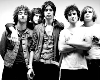
He then sent us these images to help us draw inspiration into the right type of album cover we should head towards in our digipak:
This is what we will work towards when developing our digipak further
- Using the images we took which include gang like/family poses, which shows the relationship of the band
- Creating a blurred background with a pastel colouring instead of a drab england car park background as it gives of the wrong impression
- However the font will remain the same and the black and white as they work well with the images we took


No comments:
Post a Comment